Ascensus Design System and UI Kit

Overview
Duration
March - Sept 2022
Role
UX Design Co-op
Skills/Tools
Market Research, Agile, Sketch, Figma, UI design, Confluence
Context
Design systems are a useful tool that UX designers can utilize to
ensure that they are following. Ascensus does not have a detailed and up to date documentation of
company wide component design standards which creates
inconsistencies throughout Ascensus sites. Implemented an up to date design system and ui kit that simplified
the design and onboarding process for all UX designers including new
hires and created a more consistent and intuitive user experience.
Scope Summary

UI Kit
Research
In order to create a component library that would be easy for the team
to use, I needed to conduct market research on other companies UI Kit's
and organize meetings with the design team to
gather requirements. These requirements included
identifying all of the commonly used components, their groupings, and
hierarchies. The main challenge that I faced in this
project was
identifying the proper groupings and hierarchies for
each component that would be easy for the
UX designers to locate. I took an
agile approach and created only 5 component pages and
groupings and presented them to the team. After hearing their feedback,
I was able to then easily change the groupings and gain a better
understanding of how to move forward with the rest of the pages. I
continued to present my work every couple of weeks to make sure that the
team was satisfied with them.
I learned the value in iterative design and working in
stages.
Design
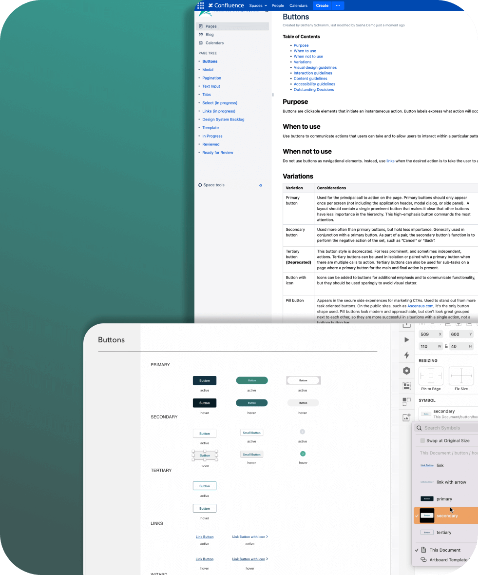
I decided that it would be helpful to show examples of
how each component looks in their different states on
each page so that the desingers could copy them or switch them out from
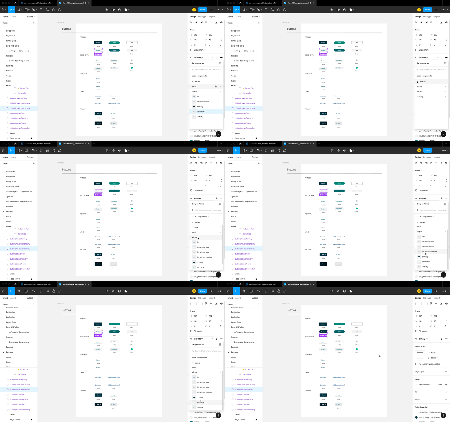
the sidebar. Our team also chose to switch to Figma later on in my
co-op, so I also created a
ui kit for the components in the Ascensus.com website in
Figma.

Design System
Research
The second part of the project was to then create a
documentation of how to properly utilize components. I
conducted market research on the best practices for
creating a design systems by looking at lots of different sources such
as Google's Material design, IBM's Carbon, and Adobe's Spectrum
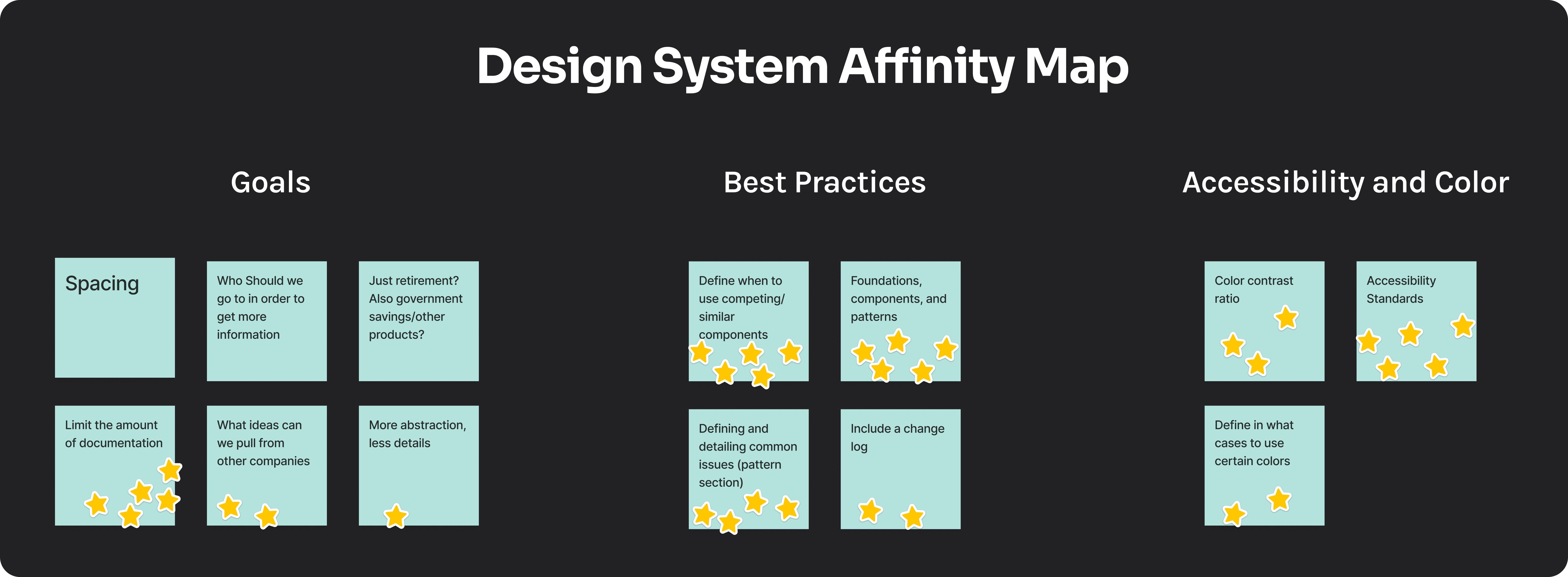
Design pattern libraries. In order to hone in our specific goals for the
project, I helped to lead a meeting where the UX team
identified the stakeholders of the design system documentation, their
needs, and a platform for where to create the design system.
We concluded the meeting by making an affinity map and voting on the
sticky notes to define our main focus areas. Here are some of the
decisions that came out of it:
- Stakeholders: UX team
- Solely focus on documenting component standards for V1
- Document standards in Confluence

Design
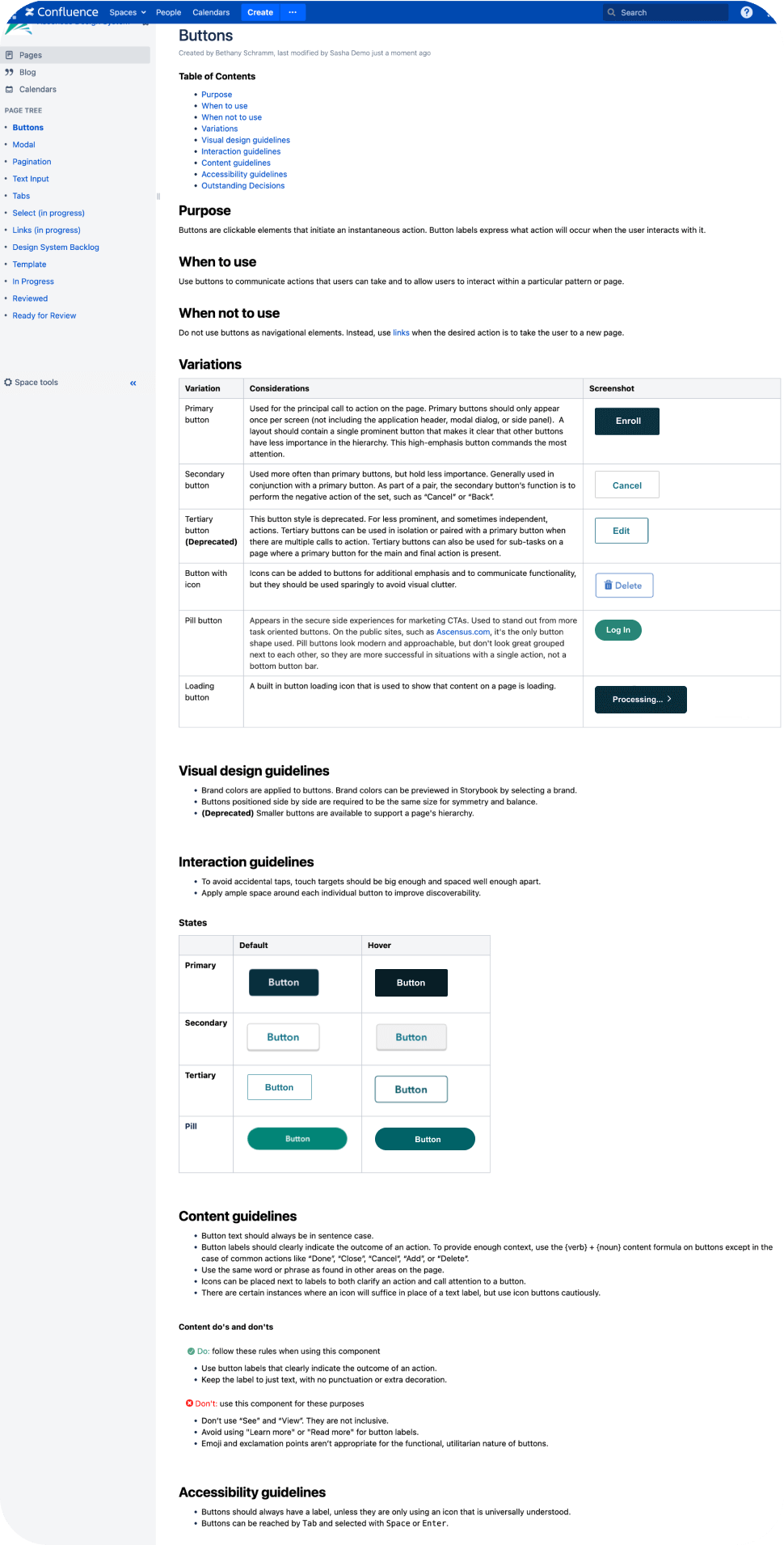
Through market research and gathering requirements from the team, I
discovered that key features in the design system are
component variations, displaying components in their different states,
defining content do's and dont's, and accessibility guidelines.

Takeaways
- Using agile methodology for a phase out approach for a project ensures progress
- Documentation is necessary for consistency and organization
I found that utilizing the agile methodology by sharing
my work with the design team in stages, helped to move
the design process along and ensured an intuitive experience. It is
better to change a few things rather than having to go back and redo a
full project.
It is very difficult to keep up with a system that is constantly
evolving and updating their website. Keeping an organized document of
new design updates is valuable and necessary for
ensuring that designers up to date with changes and creates a
consistent user experience. This applies not only to set standards, but also for
undecided decisions that should be recorded in a
backlog in order to set new standards in the future.

